The A/W 22/23 Fashion Theme Trend of Sensory Hunger
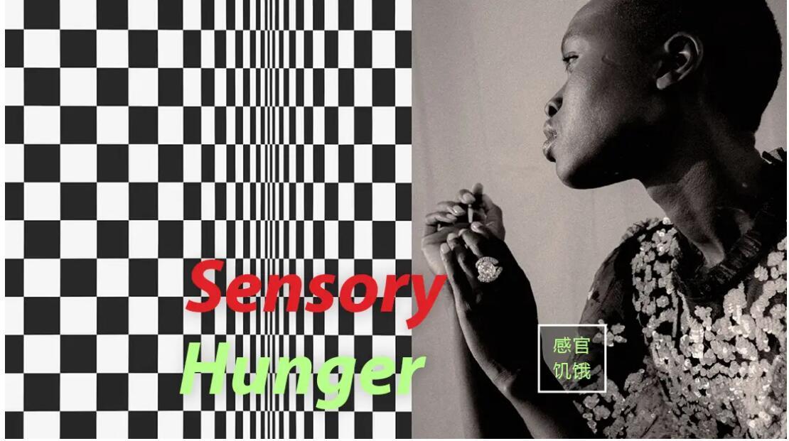
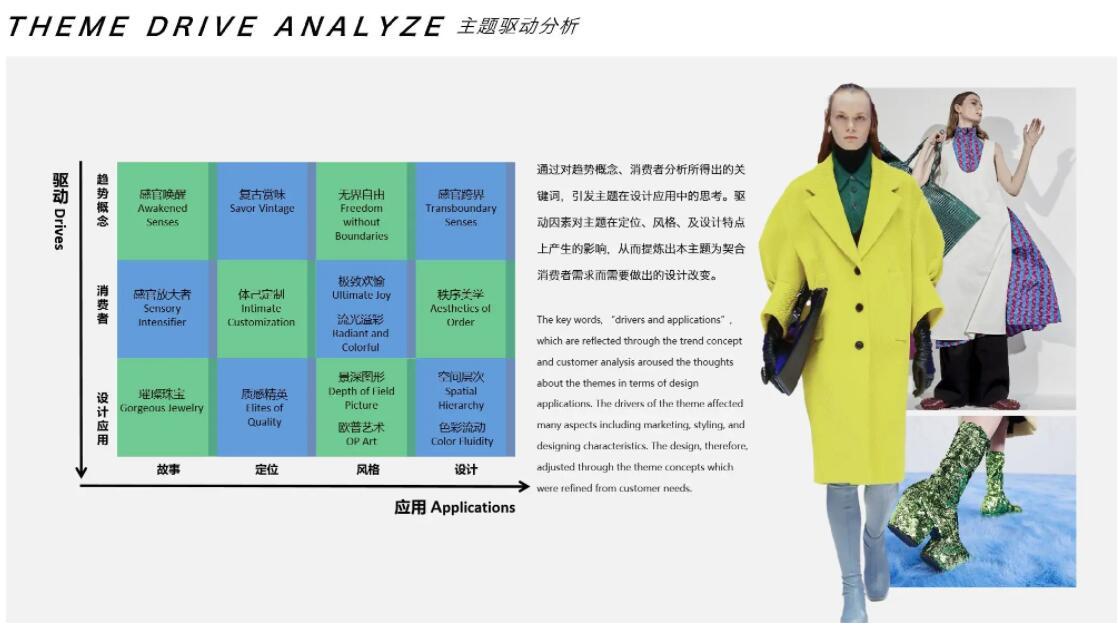
In the era of overloaded information, our senses are easy to get tired and hungry. So we need the stimulation from all aspects to awake ourselves. The Sensory Intensifier pursues orderly aesthetics and transboundary senses to present the Intimate Customization of retro quality elites. The psychedelic visual effect of Op Art is fused with the extreme joy of Radiant and Colorful to reach the inner senses. Spatial hierarchy and color fluidity refine the real requirements of consumers, and extend the collection design and structural features of production.
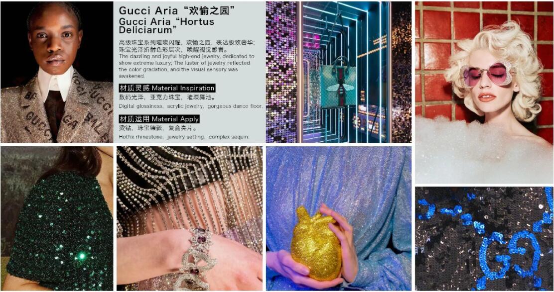
The high-end jewelry collection of Gucci Aria, Hortus Delicarum, selects unique gemstones to echo the eclecticism aesthetics of Alessandro Michele. Orderly and symmetric inlay uses glossy differences to show the beauty of imperfection. The all-over decoration of digital glossiness and acrylic jewelry on clothing exudes the gorgeous visual effect of dance floor. Starry rhinestones, jewelry chains and complex sequins convey the luxurious value of ultimate joy. The light reflection and flowing effect of materials endow people with interactive experiences of sense.
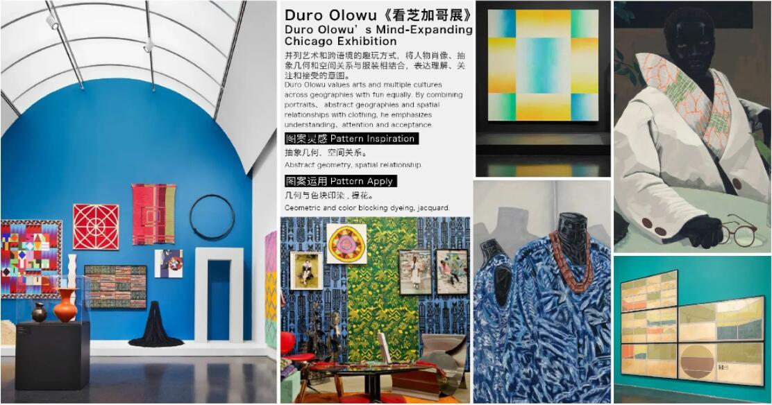
The Chicago exhibition of Duro Olowu crosses time, position, gender and race. The private collections of this British designer, such as photos, paintings, sculptures, textiles, and movies, stimulate visitors’ senses from multiple dimensions. Clothing design is combined with human portrait, abstract geometry and spatial relationship through the expression of Juxtaposition Art and cross-context culture. We can get pattern inspiration from this exhibition that geometry can be integrated with hand-drawn strokes and neon color combinations to increase highlights.
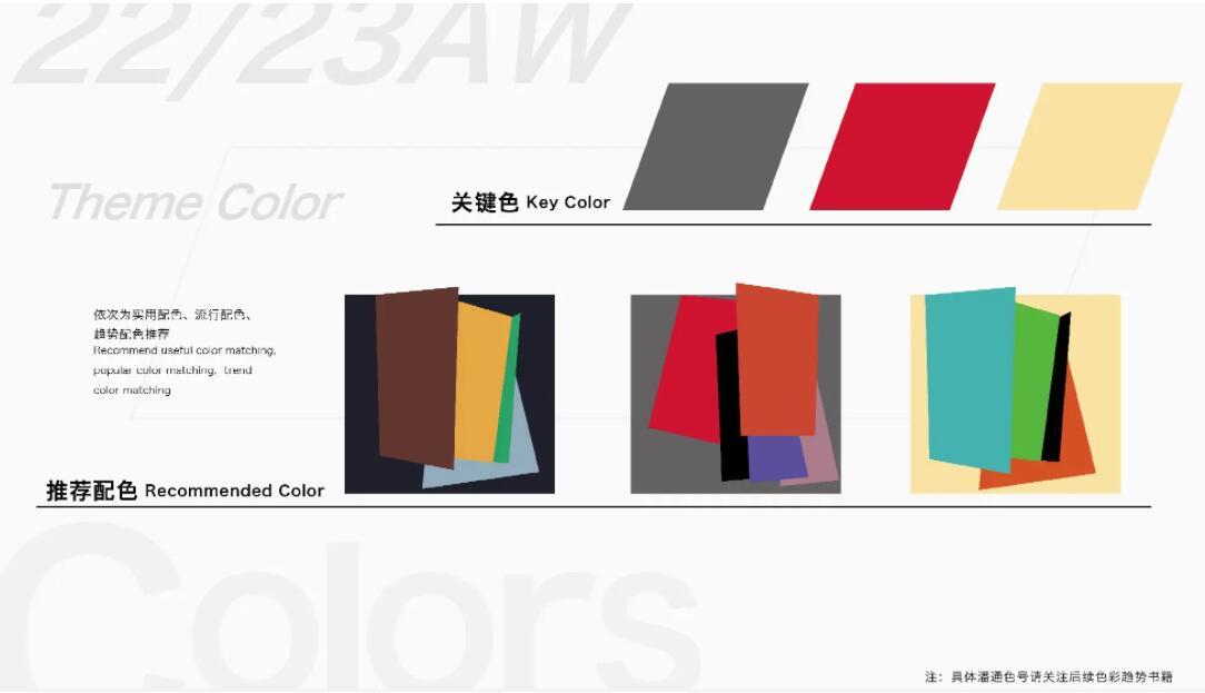
The palette of Sensory Hunger is eye-catching and fluorescent. High-saturation and neon bright colors are added into the basic black and neutral gray to strengthen the contrast. Intensive visual tension is the principle of color combination. The ice-cream yellow of S/S is maintained to be used on warm-touch materials, and the fusion with saturated colors catches eyes. The following three key colors will be used throughout multiple occasions of the A/W design development.
For a full report, pls visit https://www.popfashioninfo.com/details/report/t_report-id_10487-col_125/

 Author:Tom
 2021-06-07


